Pencil Over Pixel: How I Design Communication Systems That Bring Clarity
Why I stopped using Figma in 2018 and started sketching every interface by hand.
Written by
Abayomi Ogundipe
Founder
3 min read
I stopped using Figma in 2018.
Not because it's a bad tool. It's actually brilliant. But I found myself spending hours staring at screens, tweaking pixels, chasing perfection that didn't exist yet.
I needed to think, not polish.
So I picked up pencils again. Stencils. Sketchbooks. Paper that didn't judge my messy wireframes or half-formed ideas.
That shift changed everything.
Planning and reflections stimulate ideas
The problem with Pixels Too Soon
Here's what happens when you design directly in digital tools:
You make decisions before you understand the problem. You choose colors before defining hierarchy. You obsess over rounded corners when the structure isn't clear yet.
The interface becomes a cage. Beautiful, but constraining.
I've seen millions of websites. I've studied UX laws, interaction patterns, design principles until they became second nature. That knowledge lives in my head now. I don't need the internet to access it.
I need imagination. Space to think.
Pencil Over Pixel
When I sketch with pencil first, clarity emerges naturally.
I draw boxes. I map content hierarchy. I think about what users need before I think about what looks pretty.
No layers panel. No design system tokens yet. No pressure to make it "production-ready."
Just structure. Intent. Communication.
Here's my process:
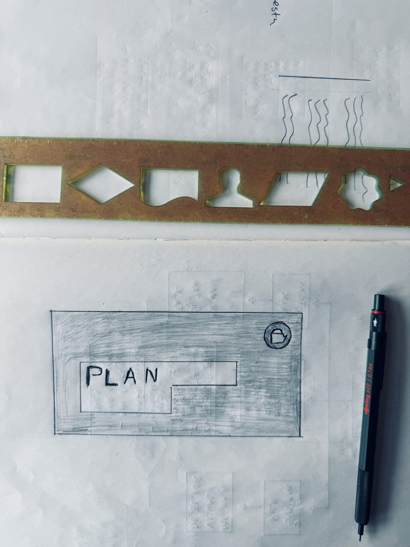
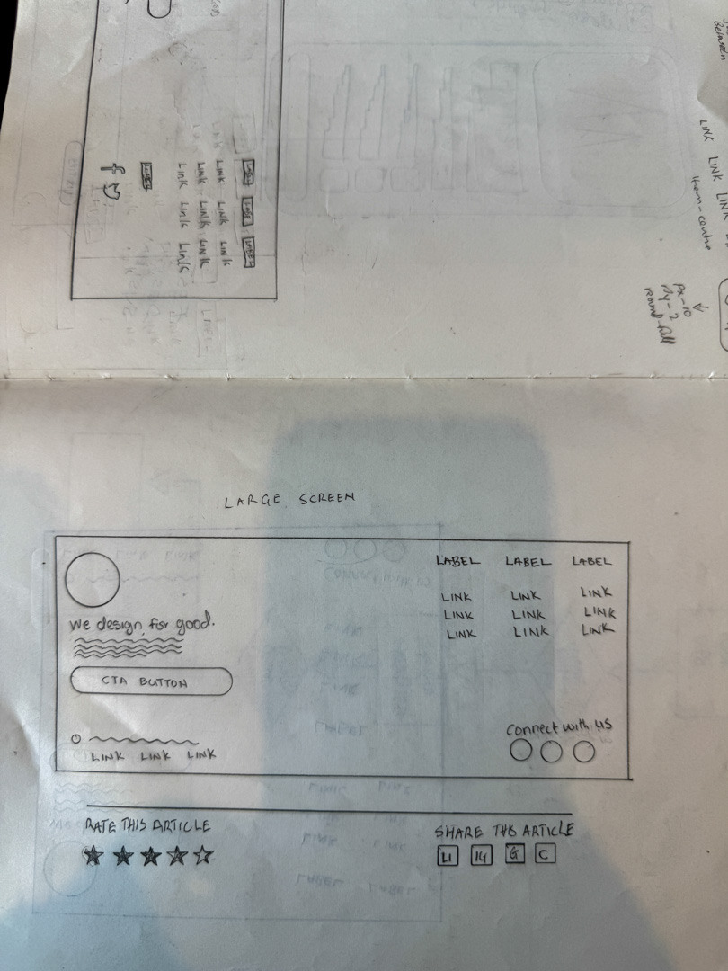
Sketch the structure - Low-fidelity Wireframes on paper, thinking through user journeys
Map the hierarchy - What matters most? What supports it? What can wait?
Define the foundation - Typography, spacing, color meaning (not decoration)
Translate to digital - Build the system in code, honoring the clarity from sketches
It takes time. But it's worth the time.
Because when the foundation is clear, everything else becomes easier.
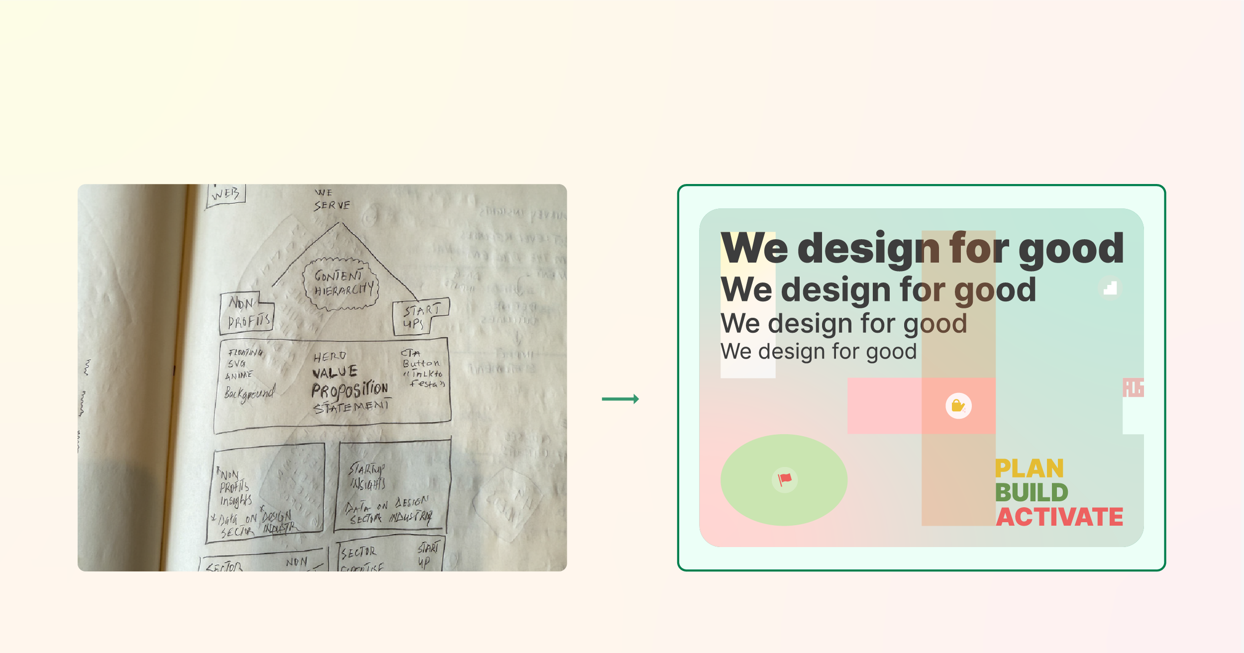
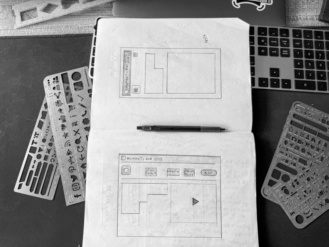
Drawing Festa's header and footer navigation system
Building Festa's Design Foundation
When I started building Festa's communication system, I needed clarity. Not decoration.
This website needed to speak to our audience: Nonprofit leaders, change makers, social impact startups, NGOs, who are spend time on screen and probably overwhelmed reading, learning and watching.
I couldn't afford to waste their attention on flashy animations or confusing navigation.
So I started with my sketchbook.
Page after page of wireframes. Content hierarchy maps. Navigation patterns. Typography scales. Spacing rhythm.
Every sketch asking: Does this communicate clearly? Does this serve the user? Does this reflect who we are?
Festa Design Foundation came from those sketches. Not from browsing design trend sites. Not from copying competitors. From thinking deeply about what our audience needs from us.
Festa Design Foundation
After months of sketching, testing, refining, I built Festa's design foundation.